
The assigning of this project came in the midst of one of the most chaotic times in a teacher’s life- end of term. On top of finishing grades for 150 students and dealing with parent and student inquiries about how to improve grades, as a school we decided this would be a great time to hold a college and career fair for our 8th grade and AVID students. Being the AVID co-coordinator, I had the responsibility of organizing the event.
The event turned out amazing. We had 30+ professionals, counselors from our high schools, and 9 colleges/education programs. The kids enjoyed it and were really appreciative for the opportunity, with the exception of one who stated it was far too stressful to think about the future (adulthood will be a fun experience for that kid). I had a bunch of people ask what AVID was, so it gave me inspiration for my graphic design project: make a graphic representation of what AVID is.
AVID is program aimed at closing the achievement gap by giving kids the college readiness skills for success within the global society. Recently they’ve been shifting to try to include more career focus, since we realize not every kid is destined to go to college (not because they’re not capable, just because not everyone should be expected to take the same path).
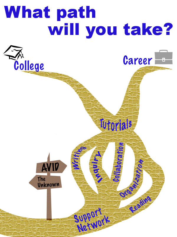
Originally I was intending to use photos from our events to show what AVID is like. I received a lot of photos my coworkers took at past AVID events. None of them really jumped out at me; they didn’t make the program seem exciting. I started from scratch with the idea that AVID is a path you can choose to take.
I used Creative Commons to find clipart images of a crossroads sign and tried to find a branched path. I had no luck finding a path, but did find a nice clipart of a dead branched tree, so used that as a base for a path. I decided to have the path go upwards since it felt like more of a journey forward that way. The path is also shifted to the right side of the page to follow the rule of thirds. I took the main components that makeup AVID and placed them along the path so kids could see what being a part of AVID would entail. All pieces were written in the same font and the same color, the similarity suggesting that they are all connected. The colors used for the main components are AVIDs colors: blue and gold. For the other components, neutral colors were used so they didn’t distract from the message of AVID.
After making this graphic I double-checked the requirements and noticed that it said it must include three images. I got a little stressed that images means photos, so I began to think that the design didn’t meet requirements. I made a second design project with photos just in case. I don’t think it follows as many design rules, and overall I feel like it got to be too busy looking. My husband likes to constantly tell me I’m an overachiever, so you bet that I’m throwing it on here just in case the first one doesn’t make the cut.
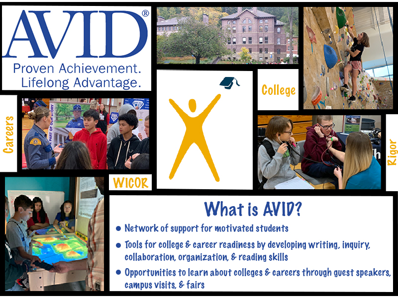
Photo Permissions for 1st design:
Crossroads sign: “jalan persimpangan” is licensed under CC0 1.0
Tree: “branch” is licensed under CC0 1.0
Graduation Cap: “kolej” is licensed under CC0 1.0
Briefcase: “office” is licensed under CC0 1.0
Photos for the 2nd design were all taken by my self or given to me with permissions by my co-workers J. DeLazzari & D. Hendrickson.

Hi Kacee, I really like the collage you created. The front matter frames the story of what you are communicating nicely. Having context provided prior to viewing your work enabled me to navigate through your ideas with ease. As I scrolled down, I was immediately struck with the question of “what path will you take?” I think the graphic represents the confluence of a golden stream or river system. That is not important to the visual cues that the messages in the paths lead your eye. You use gestalts continuation theory nicely here. I also appreciated the texture you imparted into the golden rivers. I call them rivers and found myself re-looking at the beautiful texture you utilized. The ambiguity of what the golden streams are add to artistic interest for me personally. Moving down the page you provide more context and useful information for the viewer to digest. You spell-out your use of creative commons photo’s which is helpful. I have to say the way you provided credit for the photo’s was far more professional and tidier than the way this writer provided mine. I like the hierarchy with size similarity in the collage. The whole being greater than the sum is used nicely here. Nice use of framing. The assignment mandates that the viewer provides critical feedback to the artist. I find it difficult to do on this site. One thing I did notice was an abundance of the various shades of blue. I like the colors however, for my eye the blue obscured the words in gold. I see how the sides of your site has the nice Robin’s egg blue on either side and they tie into one of the photos of a classroom. If you were to use a bit of fading or gradient blending, it might resolve or soften the amount of blue used in the collage. Very nice work and wonderful site. Respectfully, William McMeekin
LikeLike
Thank you for the feedback! It made me realize that I need to look over the Gestalt a bit more, because I didn’t even realize that it matched with continuation theory.
The colors chosen are from AVID’s logo, so I don’t have too much wiggle room there. Although, you did make me realize that I think I have the wrong shades, so I am going to use the dropper tool to make sure I get them exact to the logo. I think that will help balance it out a bit more.
LikeLike
Hi Kacee! Wow – you created two different designs! That’s quite impressive, given the short amount of time we had. Kudos to you! 😊
To start, I really like the story and flow of your first design. I think that you’ve illustrated very well what one is to expect in the AVID program. Your visual representation of the “AVID path” is very straightforward and clear to your audience. I also like how you used the rule of thirds to wind the pathway to the right. It certainly creates a better effect than if the path was set straight down the middle.
A couple of suggestions to consider:
• Don’t give up on your initial idea! I think that your first design creates a better conversation and allows for your audience to clearly see what the AVID program is all about.
• I think that instead of using clip art images, you can use the photos that you used in your second poster. It would certainly add more substance and may appeal more to your audience if they see real life images of what their experience in program could be.
• You can also add stock images (via CC) for “college” and “career” – and place them at end of the path. Perhaps the use of the ellipse tool to create a shape and clip your image to it.
Overall, great job! I look forward to seeing your finished product.
LikeLike
Thanks Cy!
I was doubting my first design because I thought it might be too basic/not professional enough, so thank you for the encouragement to follow through with it. For the final I think I am going to take your suggestion of putting some of the photos from the second design into it. My plan is to remove the graduation cap clip art and the briefcase, and place the photos in there.
LikeLike
Hi Kacee,
I currently work for an education agency, so this resonated with me! We’re focusing a lot on rebranding and shifting our narrative and what you’ve done in both images include important elements. I think with a combination of both graphics you’ll have the perfect design.
• Visually I would say the second image is more appealing, however the first image is more creative and powerful! As a way to improve the graphic(s) I would do a combination of the two! First, I’d suggest cleaning up the pathway lines. For example, make the widths even and instead of closing out the top two points maybe extend them all the way to the edges. Making adjustments to the paths will help the text become a little easier to read and it will keep the messaging that college and a career isn’t the end of your journey. Second I’d add some of the images from the second graphic into the first graphic to fill the white space surrounding the paths.
• The next element I’d improve is the text/written language. I’m wondering if there’s somewhere you’d be able to explain what some of the acronyms mean (for those who don’t know; AVID, WICOR, and RIGOR). Maybe if you add some of the images to the first graphic then you can have highlight boxes or captions of some sort with quick facts?
• In your first graphic you did a great job implementing visual and intellectual unity! For those familiar with AVID, the blue and gold colors will be familiar to them. In addition to the colors, the messaging is right on point! The pathways clearly illustrate that there are multiple paths and options to success; whether that be to college or a career. On the otherhand, in the second image, it was smart to include some bullet points explaining what AVID is. It’s also cool that you included imagery; college, careers, student interaction, etc. Overall, your messaging is the strongest element so far. It’s clear, concise, and engaging.
Good job!
LikeLike
I got kind of excited when I noticed you worked for OSPI. Based on some of the discussion posts it looks like most people are involved in HR, so I anticipated being the only person who was involved in education.
You make a good point about the ending of the paths. Once you mentioned that I noticed that they did look very final, so I am going to fix that for the final. I’m also going to see about replacing the clip art with some of the photos.
Thank you for the feedback!
LikeLike
Based on the feedback from Cyrille, William, and Chelsea I think both designs serve a purpose, but they would work better with different audiences. My first draft with the clipart is more simplistic, and I think it would work best with a younger audience, like the students we are trying to recruit into AVID. The second design I made comes across as being more professional, so I believe works best with an older audience.
For my final design I am going to focus on the first one. Based on the feedback, the first thing I need to look at is the colors. I know that I chose the colors because they are the AVID colors, but I think the hues that I got were a bit off. I am going to have to import the AVID logo and then probably use the dropper tool to make sure my colors are accurate. I liked the suggestion of extending the paths past college and career. I hadn’t considered that ending the paths made those choices seem final and like there was nothing past them. It was also suggested that I try to blend some of the pictures into my design. I think instead of using clip art at the end of each path I am going to try to incorporate photos from the second design. I was unsure if I should frame the pictures or try to cut them out and blend them in (like with the cougar and building in the last tutorial). After talking it over with one of my coworkers, I think the best option would be to cut them and blend, but I will try both to see what works best. Lastly, I know when I make my post I’m going to have to focus more on explaining the process of creating the design and which techniques/tools I used.
LikeLike