Create a chart that shows the breakdown of how you spent your time last week. It should show each activity with a total of how many hours you spent doing that during the week.
Answer the following questions in complete sentences.
How many hours of sleep did you get each night, on average?
Was there any time you didn’t do anything? How many hours?
Was there anything you needed to do that you didn’t have time for? If so, what?
Make two lists- one of activities that you need to do and one of activities you would like to do.
I’m going start off by saying I had a blast this semester!
Adobe is always something that I’ve avoided. I know that they had amazing products, but I also know that they aren’t the most user friendly. I’ve made attempts, but I always lost steam when I hit a roadblock since I didn’t have the time to figure out how to do what I needed to. It was definitely a good thing that I finally got to schedule some time into my schedule to devote to learning them.
The project that I chose to do for my reflection is the Logo Project.
My intention with this project was to create a new logo for our school that could be printed on T-shirts because a handful of staff didn’t like the one we’ve been using this year (we don’t know where it came from or who approved it, it just magically appeared one day). The one we’ve been using is:
For the original project I sent out to create a logo that had our school colors, our mascot (which is the Timberwolves), our name, the word staff, and the school pillars (respectful, responsible, safe, and determined). My rough draft had all of those things, but I wasn’t happy with it because it felt cluttered. My final that I submitted was a lot more appealing to the eyes, but we had to cut out some of the things we wanted in the design in order to achieve something we liked.
Rough Draft
Final Draft
While I was happy with the final draft, I didn’t love it and I knew it could be better. When the opportunity came to redo a project the logo kept sneaking into my brain. I was hesitant though because I was clueless as to how to improve it.
At our staff meeting Monday we approved a new mission statement. Admin made a comment about creating new posters to go around the school with the mission statement; naturally, the logo would be a part of it. That lit a fire under me to get moving on a new logo so I could stop the spread of the current one.
While I now had the motivation, I still lacked the creative spark. In an attempt to avoid grading, I opened up my final draft file and decided to just added our pillars underneath the school name.
It was okay, but it could be better. I thought would try to put our pillars behind the wolf and wrap them to be circular, thinking that it would make it look like there was a moon behind the wolf. To achieve this, I had to learn how to curve the text to a circle. After trying to figure it out (and failing), I found a video that showed it was pretty easy; I just had to create a circle and then use the “Text to Path” tool when typing. I ended up with:
The writing didn’t have the effect of looking like the Moon like I had hoped. My next idea actually came from looking at our original school logo. I figured that if admin already liked that one, then maybe I could use a similar set up. I decided to try a close up of the wolf head on top of our school name, with the pillars circling around it. To isolate the wolf head I had to use the point delete tool and delete all points within the body of the wolf until just the head remained. I also decided to change it to a white background. Most of the time the logo would be put on things like letterhead, so I had to make sure it would work with a white background. This left me with:
I really liked the look of the wolf and the school name together, but I thought the pillars looked ridiculous. They were too spread out, so it made me wonder if I actually needed to put them in a full circle or if I could just put them curved around the top as a half-circle. Once I did that I started to really like the design and from there on out it was just little tweaks to get it perfect. The Cedarcrest looked a little dark, so I played with the gradient. Eventually it was decided that the words popped better if the gradient was eliminated. Then I played around with the stroke on the school name. The second stroke, the white, didn’t show up on the white background, so I switched it’s positioning with the gray. This allowed the words to really stand out against the white, and I started to love the design. To make sure it would be good for multiple printing situations, I took it and placed it on a back background (since if we printed it on a shirt it would most likely be black) and changed the pillar wording to white.
I’m glad that we got a chance to redo one of the projects. I went from having “designer’s-block” (is that what they call it when you’re creatively stuck? Like writer’s-block but for designs?) to creating a design that I’m kind of in love with. The logo is simple, but I think that’s what makes it so effective. The best news though, is that I’m pretty sure that I’ve got admin sold on the new design as well!
These last two projects have been kind of a roller coaster ride, and not just because the world feels like it’s in shambles.
I started out wondering how I was ever going to pull off putting together compelling stories, and then somewhere along the way it kind of hit me- telling stories is what I do for a living.
Really when you look at the bare bones of what a teacher has to do, at the basic level we have to be good storytellers. We have to get information across to people in a way that engages them and bonus if they walk away feeling like they learned something. Some days I’m great at it and the other days, well I try to learn from them and do my best not to repeat them.
Since storytelling is what we do, I guess it was a good thing that all my source material came from my coworkers. My goal was to create a “College Talk” video that we could show our students, which is part of our criteria for being an AVID school. I sent an email out to a handful of my coworkers and asked them if they would record their answers to a few questions. I got responses back from 4 of them and then I decided I should be fair and shot my answers too. When it came to putting this together, I really struggled with picking just one question to focus on. I went with our answers to why we picked the colleges we attended because I thought it had the most diverse responses to it.
I started by watching each clip and marking out the sections where we discussed what college we attended and why we made that choice. While I’d like to say I was really strategic in how I ordered the clips, really I just put them in the order of which the clips were imported. I realized later that the order fit nicely, because it broke up the two clips of people who picked WSU and the two that picked Western.
Watching it through with just the interviews, I realized that it wasn’t very engaging watching the interview clips. I decided that it needed some pictures to break it up. Ideally I would have liked to throw in some pictures of each interviewee while they were at their college, but that material was hard to come by. Since the intended audience is eventually our students, I decided that any time a college was mentioned that a picture of that college should be shown. Even though our kids hear about these schools and they know they exist, they have absolutely no idea what any of them are actually like. I thought showing pictures of the colleges would help keep their interest. I used a combination of Creative Commons and Wikimedia Commons to find images. The image of Jasmine with Willamette’s mascot she sent to me along with her interview. The only other material I had to ask permission for was the WSU Game Day picture; my husband oh so graciously gave me his stamp of approval.
Once I had the interviews and the pictures lined up, my next step was to go in and use the razor tool to cut down the time. I cut “ahhh”, “umm”, and pauses to save as much time as possible. The good news is, that since these are all interview clips, it was pretty easy to cut stuff and it wasn’t noticeable that the video cut to a different scene. For the ones that were really noticeable, I tried to cover up with a photo in place of the interview. My next step was to go in and add transitions anytime the visual changed. I played with a few different ones that weren’t used in tutorial, just to see what they looked like. I decided that it would be best to just pick just a few transitions and use those repeatedly throughout the entire story. Then I created an introduction graphic before the first interview and a credits graphic using the graphics panel of Premiere.
After doing all of that, I got my rough draft, which ended up being like 4:28. I knew that was way over the limit, but was fine with it since it was a rough draft. Based on the feedback from my peers and the suggestions on the class website (plus my own pickiness), there were a few things I decided needed to be changed for the final:
Cut down the amount of material since I was over the time limit.
Add some kind of background music.
Fix the transitions since some of them didn’t work and others the timing was off.
Adjust the titles at the beginning of each interview- Make the font bigger AND add some info.
When it came to working on the final, the first thing I did was scoured over every clip to cut out every possible “ahhh”, “umm”, or slight stall. This brought me down to 3:58. I asked Misty if, teacher perspective, 3:58 counted as 1-3 minutes since it was technically under 4. She dashed my hopes and dreams, so I had to pick a few interview chunks, that while interesting weren’t vital to the story, and cut them. I realized that I could save a few seconds by overlapping some of the interview with the intro (J-cut) and credits graphics (L-cut), so I made that adjustment. I considered cutting one of the interviews to achieve the time crunch, but then I realized all of them had a purpose. Mine showed that sometimes you have to change your plans and sometimes people make a choice for not the best reasons. Misty’s was an example of doing a distance degree program, which most of our kids don’t realize is even a thing. Bob’s was an example of letting your career path drive you; plus he was the only male perspective. Jenevive’s was an example of deciding based upon lifestyle, as well as educational reasons (having solid reasoning behind a decision). Jasmine’s showed the importance of actually visiting your colleges ahead of time. I decided to go back to the clips and see if maybe another question could be sequenced into a story that would work within the 3 minute time limit. I looked at our responses to why we became teachers and with the unedited clips I was at 4:02. I realized I didn’t really have any good visuals that would go with these clips, so spending time making a new sequence probably wouldn’t be worth it. I went back to my original idea and again considered how I could cut time. My heart couldn’t make a decision, so I kiboshed the idea of cutting an interview. When all was said and done I got it down to 3:23 (without credits); I know it is technically past 3, but I thought I did pretty good for already cutting out a whole minute.
I went back in and adjusted the transitions and title sequences. I bumped up the size of the fonts on the titles from 100 to 125 for the large font and from 50 to 75 on the smaller titles. I added a stroke around the words too just so they popped a bit more. I added another line with our alma matters on it. When it came to transitions I decided all of the photos should have a Dissolve transition to them to be consistent. Watching my rough draft I learned that if the transitions don’t have the little Lego brick-looking logo next to them it is very possible they won’t play, even in your exported version (I’m looking at you Page Peels). That led to a fun little research project about what the colors in the time code meant. I decided to use the slide transition between interview clips because it didn’t turn the timecode red and one of the readings mentioned that it suggests a change in place or time, so I thought it was appropriate.
My final touch was to add music. I picked a free download track from SoundCloud. They had a bunch of them, so I listened for a while until I found one that I thought fit. After adding it, I tried to edit the audio through Audition, but my computer has a hard time playing the audio and video at the same time (long story short, it crashed). So I sucked it up and did what I could through Premiere. I placed a keyframe at the start of the video and added a keyframe in the track when the first interview starts. I pulled the second keyframe down to fade the music into the background. I tried a lot of different settings, but settled on -25 decibels. I placed two more keyframes towards the end (one at the end of Jasmine’s interview and one at the very end of the credit). I pulled the final one back up to 0 so the music faded in after Jasmine’s interview was complete. Then I cropped the very end of the audio off because it faded out. I placed the cropped portion right after the credits so it seemed like the audio was naturally fading. When I watched the whole video through I realized that apparently Misty and I are loud, because it was hard to hear Bob, Jenevive, and Jasmine over the music. So for my final edit I went in and adjusted the sound for all three of the interviews. Bob’s had to be adjusted to +15 decibels, while Jenevive’s and Jasmine’s were brought up to +6.2 decibels.
I am really happy and proud of how the final turned out. The best news though is that after a year of pushing “College Talk” videos, I finally have more people on my side all thanks to my rough draft.
Also, fun story, starting this course I thought Premiere was going to be the product that would be the least useful to me. I have used it every day for the last 3 weeks and I already have a whole list of projects in my head that I am going to be using it for!
Anyways, here’s my final:
Storyboard-
Time Stam
Visual
Audio
0:00
Intro screen: question that was asked
music
0:03
Intro screen
Music fades to background, first speaker starts
0:05
Interview shot of Kacee, with title- name, job position, alma matter
Faded background music and speakers response to the question
0:21
Fade into arial shot of Western Washington University
Faded background music, discussion of sister going to Western
0:26
Fade back to interview shot
faded background music, continued discussion of sister’s college experience
0:28
Fade to shot of Washington State University practice football fields
faded background music, discussion of other sister going to WSU
0:33
Fade back to interview shot
faded background music, continued discussion of sister’s college experience
0:42
Fade into shot of Boston College
faded background music, discussion of interest in attending Boston college
0:49
Fade into second shot of Boston College
faded background music, still discussing interest in attending Boston college
0:54
Fade back to interview shot
faded background music, discussing how experiences influenced decision on which college to attend
1:08
Fade into shot of Game Day at Washington State University
faded background music, identify which college Kacee attended
1:13
Slide transition to interview shot of Misty, with title- name, job position, and alma matter
faded background music, Misty discussing what influenced her decision
1:26
Fade into shot of Fisher Fountain at Western Washington University
faded background music, Misty discussing WWU distance program
1:31
Fade into shot of Whitehorse Hall at Everett Community College
faded background music, Misty discussing WWU distance program at EvCC
1:35
Fade back to interview shot
faded background music, Misty discussing decision for WWU at EvCC
1:46
Fade into shot of Everett Community College Campus
faded background music, Misty discussing reasons for college choice
1:51
Fade back to interview shot
faded background music, Misty wrapping up the discussion
1:52
Slide transition to interview shot with Bob, with title- name, job position, and alma matter
faded background music, Bob discussing visiting colleges and what drove his choices
2:06
Fade into shot of Thompson Hall at WSU
faded background music, Bob explaining why he chose WSU
2:11
Fade back to interview shot
faded background music, Bob still explaining decision for WSU
2:12
Begin fade in of Western Washington University Old main building
faded background music, transition from Bob’s interview to Jenevive’s interview
2:17
Fade to interview shot with Jenevive, with title- name, job position, and alma matter
faded background music, Jenivive identifying the college she attended
2:24
Fade to shot of Mt. Baker
faded background music, Jenevive discussing the environmental features that influenced her college decision
2:29
Fade to Alturas Lake
faded background music, Jenevive discussing the environmental features that influenced her college decision
2:34
Fade back to interview shot
faded background music, Jenevive discussing 3rd reason for choosing Western
2:45
Slide transition to interview shot of Jasmine, with title- name, job position, and alma matter
faded background music, Jasmine discussing colleges she considered
2:53
Fade to shot of Brelsford Visitor’s center
faded background music, Jasmine mentioning visit of WSU
2:55
Cut to shot of Colorado State University
faded background music, Jasmine mentioning visit of CSU
2:57
Cut to shot of Willamette University
faded background music, Jasmine mentioning visit of Willamette
Learning video editing software couldn’t come at a better time. With the school closures we’ve been forced to rethink how we teach content. There are some excellent resources out there, but based upon the kids you have in your classroom, often times there are certain things you know you need that just don’t exist. Case in point, this week my kids were learning about the Law of Conservation of Energy. There are plenty of videos out there explaining what it is, but they don’t really explain it at the level that an 11 year-old can understand, let a lone an 11 year-old that has only been learning English for 5 months. I had the wonderful opportunity to put my Premiere skills to good use and make a video for my kids to help them understand the topic. Based upon their quiz scores this week, it looks like I successfully got the point across (they’ve never done so well on the question before!).
Now you’re probably thinking that’s what I’m going to show off for my rough draft, show off my Law of Conservation of Energy video. That was definitely the suggestion of my co-workers, but I’ve always been overly ambitious, so I made a different video for this project.
When reading about this project, I immediately knew what I wanted to do; my inspiration once again came from my work with AVID. One of the things we have to do in order to be an AVID school is complete something called the CCI; basically AVID has a standard for what they expect and they ask schools that have the program to grade ourselves on nearly 100 criteria to see how “AVID” we are. One criteria is the “College Talk” criteria, which states that kids are learning about college in ALL of their classes (not just AVID). College talk is pretty vague, it just means that kids are learning about what colleges are out there, they are hearing stories about what colleges people in their lives went to, why they chose that college, hearing about our college experiences, why we picked our careers, etc. As someone who teaches two content areas, I know that I hit the college talk in my AVID class (it’s like the #1 reason why we do what we do), but I am terrible at hitting it in my science classes. I have so many standards that I have to hit, and randomly talking about my college experience doesn’t really fit into those. It’s not that I don’t think these stories are important, because if AVID has shown me anything it is how important those little stories are. When kids come back they’ll always casually mention how one of the stories they heard from one of our guest speakers or one of the AVID teachers changed their perspective or made them consider something else; yes, even those kids that I am convinced never paid attention to anything.
So last school year I tried to make a push that every staff member make a college talk video and we show them in rotation during our advisory class, that way the kids could hear these stories from all the teachers and it didn’t have to take away from our regular class time. People were on board with the idea, but nothing ever came about from anyone. My thinking is that, with this project, if I make the first one then it will spark people to start making theirs, or at the very least film themselves and send it off to me to polish up.
To get content for the rough draft I emailed a handful of my coworkers asking if they would be willing to shoot video of themselves answering these 4 questions:
Why did you decide to go to college?
What college did you attend?
Why did you pick that college?
Why did you choose to become a teacher?
I received responses from 4 of my co-workers and used the footage to make this rough draft:
While I am happy with it, I know that there is a ton of work that needs to be done with it, especially because it is way over the time limit. There were a lot of really great responses that I was not able to get in, like our responses to why we chose to be teachers. I didn’t pick those though because I thought they’d be over the time limit. I am going to play around with the footage and see if I can fit it in, so it’s very possible that my final is actually video of us talking about a completely different topic. We’ll just have to wait and see where the creative process ends up taking me.
*I shot all my clips as continuous (moving from far away to close up). If I put them all together it would have been like 9 minutes worth of film. So really this is the 10 seconds of each shot cut with the slice tool and put together to form a continuous piece.
These last few weeks have been a bit surreal. Can’t say I ever thought that I’d possibly be living through a pandemic.
While school should be a good distraction from what’s going on, this project made me miss my kids immensely. The new directions coming from OSPI gives me the impression that it will end up being longer than anticipated before we see them again. But, if there is any bright side to this, it’s the fact that I no longer have an alarm waking me up every morning. I also quite like being able to start work at 10am instead of having to pretend that I’m ready for the day at 7:30 in the morning; no one is ready for the day at 7:30!
Anyways, the idea behind this story was a spark of genius on Misty’s part; create a story about what AVID is based upon the kids who have actually been a part of the program. The whole idea was that the clip could be used during registration so that, instead of the counselors misrepresenting what we do, the AVID kids can give the reality behind what it is we do. Jenevive, my co-coordinator, and I picked 5 amazing AVID kids that have been in the program for nearly their whole middle school career and put together a list of 6 questions that we wanted them to answer. We interview them 23 hours later, so they really didn’t have a ton of time to prepare. We asked the kids the following questions:
What do we do in AVID?
How would you describe AVID to someone else?
How would you describe yourself before being in AVID? How would you describe yourself after being in AVID?
What impact do you feel AVID has had on you as a student?
What impact do you feel AVID has had on you as a person?
Why have you decided to stay in AVID/be a part of the AVID class?
We pulled them out of their 5th period class and sat down at a circular table to interview them. I recorded the kids using the Voice Memos app on my work Mac. This was a new experience for me. I know that there are some people out there that record nearly everything they do; I am the opposite of that. I hate appearing on video and having my voice recorded. I have a very vivid memory during my student teaching where my evaluator told me that I needed to work on my voice. According to her feedback, it’s far too high pitched and she couldn’t listen to it for more than 10 minutes. I think that coupled with being asked “is your mommy home” when I answer the phone (yes, that still happens, and I’m in my 30’s) has caused me to go to great lengths to avoid recordings.
Anyways, I’ve digressed. We decided while doing the interviews that I would ask the question and then the kids would go around the table and answer. They decided that each time a question was asked, a different person would start with their answer. I decided that it would be easiest for me if I recorded each question individually instead of the entire thing as one long interview. I learned that when using the Voice Memos app, in order to actually save the audio you need to drag and drop it into the desktop. You can find all of the AVID Interviews on my Soundcloud.
After getting their responses, I knew I wouldn’t have enough time to put their answers for all of the questions, so I decided to pick just a few. I knew for a fact I wanted the “What do we do in AVID?” and “How would you describe AVID to someone else?” to be included, since that was the main point of us doing the interview. I also really liked their answers for what impact AVID had on them as a person, so I decided to go with that one as well. Lastly, I decided that we needed to include the introductions so that the kids listening will know who is speaking and what their experience is what AVID.
When I put those 4 clips together it ended up being over 11 minutes of audio, so I definitely had a lot of cutting down that I needed to do in order to get it under 3 minutes. As I went to cut the clips I made the decision that I wasn’t going to cut any of the kids responses, you would hear from all 5 of them for each question. I know that they don’t always have the best answers and sometimes they’re redundant, but I felt like keeping all of them in was more authentic.
Most of the editing came in using the razor tool. I used it to cut long periods of silence where the kids stopped to think. I also used it to cut some of our less important chatter, because occasionally we would go off topic. I deleted the unnecessary clips and moved the remaining clips together to create the rough draft.
After the rough draft, I had to edit it down some more because it was too long. Valerie suggested changing the order of the questions, so I moved the “how would you describe AVID” to be the 2nd question asked. I also changed the order of a few of the kids responses. When it was asked how AVID impacted them as people, I moved Umar’s response to the front. I felt like that was a better flow, because his exclamation felt weird being at the end of the responses. There were also a few places where the audio felt choppy, so I overlapped the clips a bit to make a smoother transition.
After rearranging all the clips, the next thing that I focused on was trying to get all of the voices to be more similar in volume. I noticed that my voice was very loud and clear, where as Umar and Stephanie’s responses tended to be more quiet. To achieve this, I used the move tool to create dots on the volume bar. I would make sure to always place four dots, two at the beginning of the person speaking and two at the end. By moving just one dot before the speaker and one dot after, I was able to change the volume of just that part of the clip. When clips had my voice, I lowered the volume by about 2.5 decibels, which brought it down to a more similar volume as the students. There was one place where I had to bring it down a lot more. The “So” when I called out Umar for some reason was incredibly loud, so I had to take that one down about 15 decibels. For Umar and Stephanie’s responses I raised the decibels by about 2.5.
Here is the final product:
There are some other really great responses from the kids that I wasn’t able to fit in, so I think that I am going to make a slightly longer version that we’ll use when registering. My principal is already really happy though that we have something to use, since it looks like registration will be basically occurring online and the students have to do it on their own this year.
Once again my inspiration for this project came in the form of Misty guiding me (she’s the real MVP).
For the last 4 years I’ve been an AVID elective teacher. If you don’t know what AVID is, it’s a program that started in California awhile back that had the intent to close the achievement gap and getting underrepresented students the skills that they needed to be successful in high school and college. Being an AVID elective teacher basically means that I teach a class on how to be responsible (how do you keep your materials organized, how to manage your time, how to ask proper questions, how to interact with people in acceptable manner, etc.). We also spend some time learning transferable skills, like how to format different writing structures so that they can apply to multiple forms of writing. As an adult you’re probably thinking “that’s fantastic! So many kids need those skills!”. I whole heartedly agree, otherwise I wouldn’t consider teaching this type of class. However, our dilemma comes in convincing kids that this is an important class that they should take. Let’s face it, very few 11 year-olds want to take a class about how to be responsible and grown up, especially when they can take a class instead that allows them to launch rockets and create catapults, and I totally don’t blame them. This means that every year, when class registration rolls around, we always run into issues.
Not only is my AVID class up against basic kid nature to avoid responsibility in favor of fun, but AVID is CONSTANTLY misrepresented by our counselors!
They tell the kids that:
AVID is a study hall.
AVID is a class that goes on field trips.
All the AVID teacher does is help you with work from your other classes. If you’re stuck on an assignment, they will spend the class telling you how to solve it.
This is such a misrepresentation of what we do in AVID! It forces me to have battles in my classroom with apathetic students because they got into a class that was falsely sold to them. Nothing kills the progress of an AVID class faster than a kid that just doesn’t want to be there. Seriously, one kid can put such a damper on the entire system and experience for the rest of the kids. This is something that I battle with the counselors on every year, and it constantly falls on deaf ears.
I’ve asked in the past if I could go represent AVID when we register our students so I can say what we actually do in AVID, we take current AVID kids so they can share their stories, etc. The district has always agreed that those are good ideas, but so far they are unwilling to implement any of them.
Which brings us to where I am now. I have been out of work for a week; quarantined to my house for health issues not related to COVID. 8am on Wednesday morning I am wallowing in my lack of time, expressing to Misty how desperately I need a topic for my rough draft that I must complete in approximately 48 hours. Misty made the connection that this audio story can bridge our AVID registration issue gap; that if I can’t be there in person and we can’t take AVID kids, then I can use the audio story to tell our tale. Running off that spark of genius, I had 50 free minutes to brainstorm with my AVID co-coordinator Jenevive (since this would benefit her too) and we organized what we needed to get this project done. We came up with a list of 6 questions we wanted to ask the AVID kids, and then picked 5 fantastic AVID students, ones that we’ve been working with for the last 2-3 years, that we wanted to interview. We gave the kids less than 24 hours to get their ideas together about their AVID experience and what they want others to know about AVID. Then the following day we pulled them from their 5th period class and sat at a table as a small AVID family to have a discussion about what we wanted other people to know about AVID.
I ended up with a good 20-30 minutes worth of audio (which I posted each individual question interview on SoundCloud). To start with the rough draft I chose the questions that I felt like had the most relevance to what we wanted kids registering to know. Then I just listened to the clips repeatedly and tried to pick out the pieces I liked. I tried not to cut any answers, just cut down on the “umm” and “like” the kids kept repeating, while cutting down the long stretches of silence.
Currently I have created:
I don’t know how engaging it will be to a group of 5th graders, but I feel like it’s at least a good start for the message we want to get across.
So, confession time… this is not my first experience with graphic design.
Now, from one fellow teacher to another, I’m realizing that I probably shouldn’t have said anything because now you’ll have expectations of me, so I think I should clarify a few things:
I have absolutely no formal training.
99% of my graphic design experience is in Corel Draw, 1% is with Photoshop.
Why would I have graphic design experience but no training? Well, my mom bought the town’s trophy shop when I was 13 and it just so happened to be 3 blocks away from my middle school. I might have been a weird child, because I always went to the shop after school. In all fairness, it got me out of taking the bus and she usually gave me enough money at the end of the day to go buy a milkshake from the burger joint next door.
I don’t think my many years of trophy and plaque designing has given me much of an edge in this class. That 1% of time in Photoshop was typically me using it in an attempt to clean up logos, getting irritated after 20 minutes of trying to make the tools work, and then switching back over to Corel to fix the logo in what my husband lovingly calls the “long and time-consuming way”. The one thing I think it has given me an edge on is that I have a lot of experience with setups and identifying ways they can be improved, like to the point where I can tell if something is just 1/16 of an inch off (it’s a weird, kind of useless, and usually very irritating superpower). It might also help explain why I’m so picky when it comes to making things.
So why did I throw myself under the proverbial bus and mention my background? Because, as a person who has regularly been given raster logos and had to find a way to make them vector, I LOVE the concept of Illustrator and what it can do. As a rational individual who wants things to be pretty straight forward and user-friendly, Illustrator is incredibly frustrating.
Anyways, you’re here for a logo. I’ll remind you that the whole project started with me going to Misty, who gave me the idea to make a logo for our next staff shirts. The criteria were:
Had to include school colors: red and black, gray and white could be used.
Should have a wolf.
Should have our four pillars on it (respectful, responsible, safe, and determined).
Should have the words “staff” and “timberwolves”, if possible.
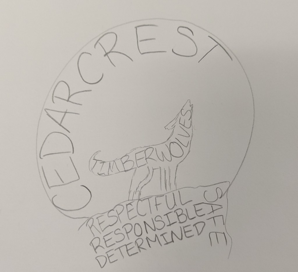
Our current staff shirts have one of those word collages on it, so I think that got stuck in my head when I started sketching. It lead me to drawing this:
When I drew it, I liked the idea but thought it would be too busy. I sent it off to Misty and got the go-ahead. I created this:
I drew the wolf using the pen tool. It started out as anchor points with flat lines, but then I gave it some curves using the curvature tool and the anchor point tool. Then I decided to focus on the moon. I knew it was possible to create text that formed shapes, but had no idea how to do it, so I went down a Google rabbit-hole. I found a few tutorials that walked me through the steps, and it turned out the process was pretty easy. All you need to do is create the text, create the shape, (make sure the shape is the top layer), and then use the “envelope distort- make with top object”. Creating the moon and rock formation took almost no time. I ran into an issue though when it came to modifying the text of the moon shape to fit the wolf. I assumed I could use the shape builder tool to create the form I wanted, but it wouldn’t work. After playing around with grouping options/shape builder and getting nowhere, I just decided to use the pen tool to outline the shapes to create a new one. I ran into another issue when it came to putting the words in the wolf. For some reason the text kept recognizing anchor points that didn’t actually exist, so it distorted the text so much that you couldn’t read it. I tried with different words (Timberwolves, Staff, Cedarcrest) and decided that staff worked best since it was the shortest word. I tried to look for another way to warp the text and found another video that showed me how to use the “make with mesh” option under the envelope distort feature. Some people probably don’t like that tool because it takes a lot more time, but I actually really liked the ability to modify each letter and get the text to look exactly how I wanted it to. It was time-consuming, but for a control freak like me, very satisfying.
When I was done, I still didn’t love the logo because I thought it was too busy, so I played around with what I learned from the Varisty tutorial to create the Cedarcrest text. To make the text I played with the text kerning, the gradient tool, and adding multiple strokes.
I was really unhappy with how hard it was to read staff in the wolf, so my first solution was to fill the wolf in:
I also took some time to fix the words in the rock and modify the letters in the moon so that it was easier to read. I liked it, but it didn’t meet all of the guidelines that Misty had given me, so I tried another setup:
I thought this would make the words easier to read. I switched the gradient on the Cedarcrest font so that the red was pointed towards the red rocks and the black was on the top; I think I was thinking of the sun setting and the moon rising when I did it.
I was a little bit happier with this, but still thought it was too busy. I spent days telling myself I was just being too picky, and then realized that I shouldn’t be the only person’s opinion that matters. S. She agreed with me that they had good elements, but they were too busy. We started moving things around and ended up with a bunch of different layouts.
Since we agreed that the layouts were too busy, we started cutting stuff out. The pillars were the first things we ditched. While they are important to our school culture, they aren’t as important as our name or the wolf. She really wanted to keep the “staff” in the design, but we agreed that it didn’t need to be huge. We left it in the moon because it still showed the cool text wrapping and gave the effect of the wolf howling at the moon.
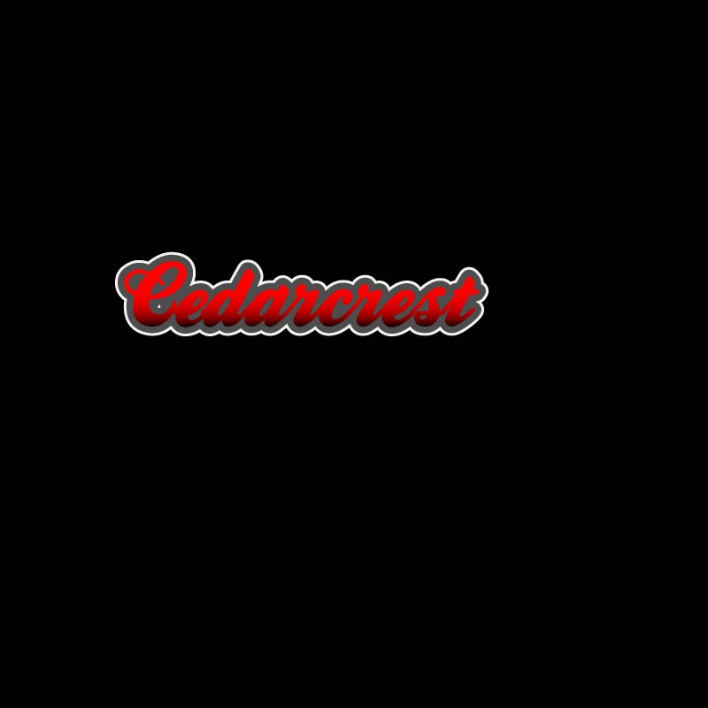
Misty pointed out that the staff font stuck out like a sore thumb and didn’t work that great with the Cedarcrest lettering. I changed the “middle school” font to be the same as the moon in an attempt to pull it all together. Once it was changed it became pretty obvious to us that the simplistic layout was the best. This ended up being the logo that we liked the most (and my official final product):
I will admit, this project threw me off; I chalk this up to lack of inspiration.
It’s not that I didn’t have anything to make a logo for, there are plenty of things that I could have made a logo for. I had a hard time narrowing it down as to exactly what I wanted to make the logo for. AVID already has a logo, so that wasn’t an option. My next thought was to make one for our science department, but my teaching partner and I made one a few years ago. I thought I could redesign what we did, but I couldn’t think of a way to improve the design that we originally did. I considered making a logo for our school’s makerspace, but the only ideas I could come up with were things that had already been done. My last thought was to make a new logo for our Lego League team, then I pulled up the “Beenana” that the kids created a few years ago and felt too sentimental to mess with it.
Since I was stuck, I went to bug my teaching BFF and see if she had any suggestions. Misty told me that we needed to get new staff shirts, but they didn’t have a design. We both agreed that we didn’t want our current school logo on the shirts (sorry Bob!).
Now you may be asking, what is wrong with this logo? First off, it’s a raster image, which makes scaling it a nightmare. Unless we wanted it no bigger than a two-by-two square on the t-shirt, it would have been a problem. Secondly, it doesn’t even incorporate our school color (red). Third, my gut just doesn’t like it. The wolf is too complicated, the circle should have been deleted, the spacing of the words around the circle needs adjustment, etc. That might seem picky of me, but if I’m forced to wear this thing on a shirt once a week, then I want to like it.
So Misty and I were in agreement that the best use of my time would be to make a logo for our school that we can use on our shirts (and other things like social media). Since she’s in charge of ASB and has the final say in what goes on the shirt, I basically treated her as my customer and asked her to give me a list of requirements. This is what she came up with:
It had to include our school colors: red and black, I could use gray and white too if needed.
It should have a wolf, possibly howling at the moon.
It should have our four pillars on it (respectful, responsible, safe, and determined).
It should have the words “staff” and “timberwolves” on it if possible.
Using those requirements as a guide, I came up with this:
Now I’m going to be honest, I don’t love it.
Not only did I miss some of the requirements Misty wanted, I see a lot of design flaws with this, which I won’t go into detail with since I’m going to be getting feedback. Even though I don’t love it, there are elements that I like, and I think with a bit of tweaking would be really nice in a final design. I’m thinking my final will probably take a pretty different route, one that might include some of the things I tried when playing around with fonts.
I think after completing the rough draft the spark of inspiration has finally come, it’s just going to take awhile to get a final product I’m going to be happy with.