
Today is the day that we reveal our final design for the Graphic Design project. My final looks pretty similar to the draft with only some minor (but effective!) edits. Most people would think “oh, that probably took you no time at all to fix”. That’s definitely what I was telling myself as I sat down to work on it.
Fun story: the final took me nearly 4 hours to edit.
For some reason Photoshop wouldn’t let me apply filters to anything.
“How is that possible?”
I wish I knew, maybe I could have fixed the issue sooner. When I first ran into the issue I asked my husband for help, since he has had to photoshop my brother-in-law into our family Christmas card not once, but twice. He hovered over my shoulder, telling me the steps I needed to do to apply the filter. When it didn’t work he proceeded to tell me that I use photoshop wrong; I pushed him away while telling him to go supervise the Lego League kids. I thought the issue was just with the file, so I opened one of the tutorials to try apply a filter to it; I knew it should work because I had been able to do it in the tutorial. The picture remained the same. I scoured the internet to figure out how to reset all preferences, still no filter application. Ultimately I had to uninstall and reinstall Photoshop in order to fix it and creating an entirely new file for the final in the process.
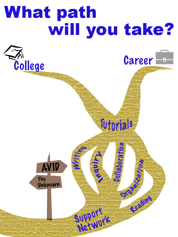
Now that you’ve heard my sob story, here is my rough draft:
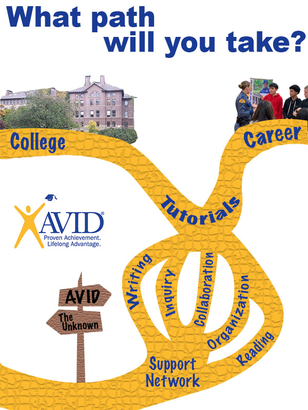
And here is my final:
My previous post mentioned my inspiration came from AVID and people asking me what it is. It’s hard to get an 11-year-old excited about a class that teaches them responsibility, so I find myself telling them it is a path they can choose to take. I used that analogy as the basis of the design. I started by searching Creative Commons for a forked path. I got a lot of pictures of forks and linear paths, the complete opposite of what I wanted. It lead me down a rabbit hole of roads, trails, lanes, and signage. I stumbled upon a crossroads sign, and it sparked a bit of inspiration.

“jalan persimpangan” is licensed under CC0 1.0
I liked that the sign one only had two possible paths because I could use one for AVID and the other for “not AVID”. I tried to use the tools to make it look more realistic. I started by adding a Hue/Saturation adjustment layer to turn the color brown. I was hoping that I could find a woodgrain filter, but the closest I could find was the texturize filter. Now that I had a sign, I needed a path to go with it. I started searching Creative Commons for things I knew had forks (since apparently their paths didn’t). I found a clipart of a dead tree.

I used the magnetic magic wand tool to outline the parts of the tree that I wanted to duplicate. I copied the parts to another layer and Frankensteined them together until they had a shape that I liked. At the start, I had the design set up as landscape, but as a built the path everything was too tightly packed together. A lot of paths ran off the page. I started to think that was a bad design choice since the crossroads sign labeled the path that goes off the page as “the unknown”. I figured running more paths off of the page would leave the audience confused, too many unknowns. I changed the orientation to portrait and found it more appealing. Not only did it gave me more space, traveling upwards felt like a more impactful (subliminal) message than traveling sideways. The path is concentrated on the right side of the page, following the rule-of-thirds. The solid color path didn’t look too appealing (in my opinion), so I decided to add texture to it to make it more interesting. I chose the mosaic filter because I thought it gave a look similar to a brick.
Starting design with the layout being landscape.
The words that are spread throughout the path are the main components of AVID. The course’s foundation is building relationships and creating support networks for kids, so I knew that needed to be the first thing on the path. The entire curriculum works on developing kids’ WICOR skills. Usually, in a lesson you’ll focus on one or two of the skills, but they are put to use during tutorials, which are run twice a week. Our ultimate goal is that kids will then utilize those skills to be successful in their careers and/or further their education. I played around a lot with the text settings. Most of the terms are warped to an arc so they look like they curve with the path. I also had to adjust the kerning and height of the letters using the character settings.
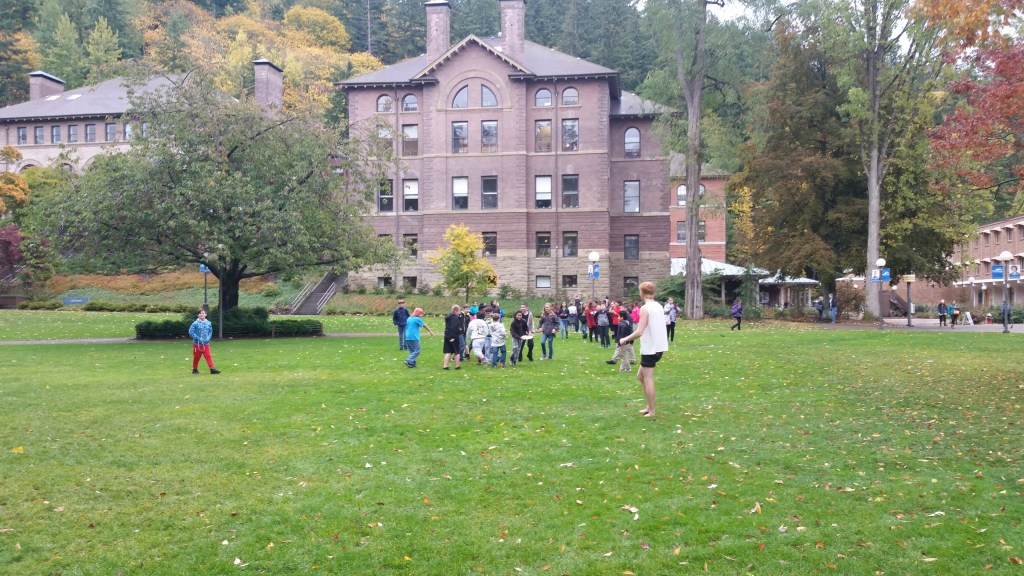
This is the original image that goes with the college branch. I took it at Western Washington University during our very first AVID field trip, 4 years ago. 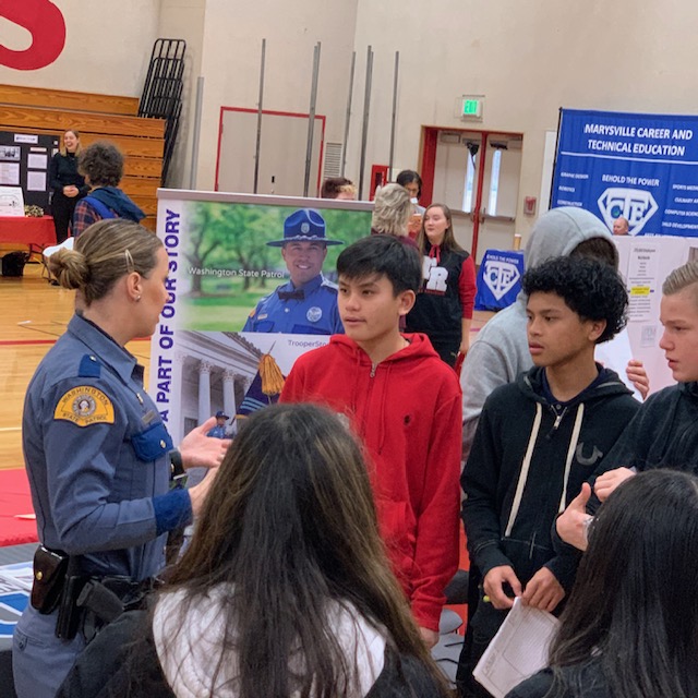
The career photo comes from our recent career fair (the state patrol booth was quite popular). Permission to use it was given by my co-worker D. Hendrickson, who took the photo
I placed pictures at the end of the paths instead of clipart at the suggestion of my peers. At first, I couldn’t decide if I wanted to frame the images or cut them out and blend them into the background. Eventually, I decided to cut and blend because putting them in frames made them feel separate and not connected with the clipart. To do this I used the magnetic magic want tool to outline the parts that I wanted. I then used the eraser tool to create a feathered edge on parts of the photos.
My color decisions came pretty easily. Since AVID is a national organization I figured it would be best to use their colors (gold and blue) as the main components. The writing popped out better when it was gold and the path was blue, but I ultimately decided on using gold for the path because of “golden opportunity”; it also reminded me of the Wizard of Oz and the yellow brick road. On my rough draft, I noticed I used the wrong values of blue and gold, so I used the dropper tool to match them to the AVID logo. When I went to change the color of the path is when I ran into my filter issue. I tried to use the fill tool, but it would only color one “brick” at a time. I decided to redraw the path with the pen tool, which was very confusing since I could see the outline of what I drew but it wasn’t a part of any of the layers. I saved it as a custom shape and then used the shape tool to draw it again. I struggled with getting it filled, but found the shape under the paths tab and linked it to a layer. I was able to color the layer with the correct gold and then applied the filter to just the path. I noticed that when I did it this way, I still have the freedom of changing the path color if I want without having to fill each individual brick. I kept the background white so that it was neutral and didn’t take away or distract from the overall message.
I don’t know if my explanation does a good enough job of explaining the design concepts we’ve been learning. I can, however, sum it up like this:
“Design is not a science, just move things around until it feels right”
Matt Greenwood
