
I’m going start off by saying I had a blast this semester!
Adobe is always something that I’ve avoided. I know that they had amazing products, but I also know that they aren’t the most user friendly. I’ve made attempts, but I always lost steam when I hit a roadblock since I didn’t have the time to figure out how to do what I needed to. It was definitely a good thing that I finally got to schedule some time into my schedule to devote to learning them.
The project that I chose to do for my reflection is the Logo Project.
My intention with this project was to create a new logo for our school that could be printed on T-shirts because a handful of staff didn’t like the one we’ve been using this year (we don’t know where it came from or who approved it, it just magically appeared one day). The one we’ve been using is:
For the original project I sent out to create a logo that had our school colors, our mascot (which is the Timberwolves), our name, the word staff, and the school pillars (respectful, responsible, safe, and determined). My rough draft had all of those things, but I wasn’t happy with it because it felt cluttered. My final that I submitted was a lot more appealing to the eyes, but we had to cut out some of the things we wanted in the design in order to achieve something we liked.
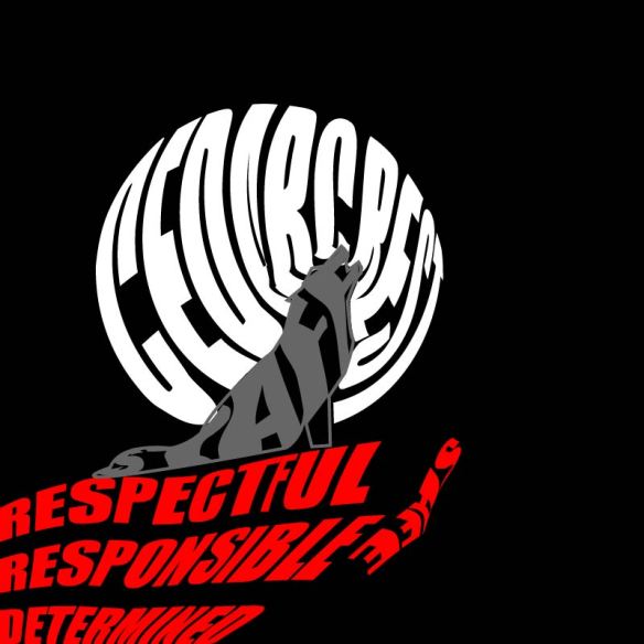
Rough Draft 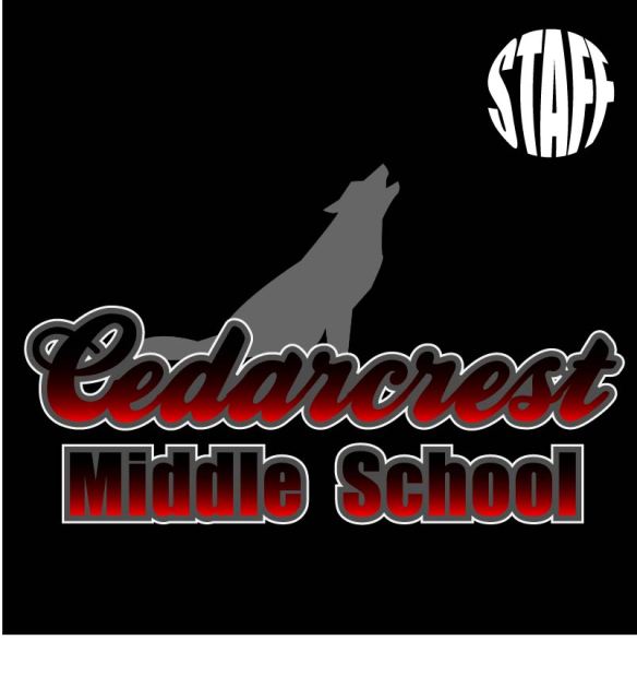
Final Draft
While I was happy with the final draft, I didn’t love it and I knew it could be better. When the opportunity came to redo a project the logo kept sneaking into my brain. I was hesitant though because I was clueless as to how to improve it.
At our staff meeting Monday we approved a new mission statement. Admin made a comment about creating new posters to go around the school with the mission statement; naturally, the logo would be a part of it. That lit a fire under me to get moving on a new logo so I could stop the spread of the current one.
While I now had the motivation, I still lacked the creative spark. In an attempt to avoid grading, I opened up my final draft file and decided to just added our pillars underneath the school name.
It was okay, but it could be better. I thought would try to put our pillars behind the wolf and wrap them to be circular, thinking that it would make it look like there was a moon behind the wolf. To achieve this, I had to learn how to curve the text to a circle. After trying to figure it out (and failing), I found a video that showed it was pretty easy; I just had to create a circle and then use the “Text to Path” tool when typing. I ended up with:
The writing didn’t have the effect of looking like the Moon like I had hoped. My next idea actually came from looking at our original school logo. I figured that if admin already liked that one, then maybe I could use a similar set up. I decided to try a close up of the wolf head on top of our school name, with the pillars circling around it. To isolate the wolf head I had to use the point delete tool and delete all points within the body of the wolf until just the head remained. I also decided to change it to a white background. Most of the time the logo would be put on things like letterhead, so I had to make sure it would work with a white background. This left me with:
I really liked the look of the wolf and the school name together, but I thought the pillars looked ridiculous. They were too spread out, so it made me wonder if I actually needed to put them in a full circle or if I could just put them curved around the top as a half-circle. Once I did that I started to really like the design and from there on out it was just little tweaks to get it perfect. The Cedarcrest looked a little dark, so I played with the gradient. Eventually it was decided that the words popped better if the gradient was eliminated. Then I played around with the stroke on the school name. The second stroke, the white, didn’t show up on the white background, so I switched it’s positioning with the gray. This allowed the words to really stand out against the white, and I started to love the design. To make sure it would be good for multiple printing situations, I took it and placed it on a back background (since if we printed it on a shirt it would most likely be black) and changed the pillar wording to white.
I’m glad that we got a chance to redo one of the projects. I went from having “designer’s-block” (is that what they call it when you’re creatively stuck? Like writer’s-block but for designs?) to creating a design that I’m kind of in love with. The logo is simple, but I think that’s what makes it so effective. The best news though, is that I’m pretty sure that I’ve got admin sold on the new design as well!
