The assigning of this project came in the midst of one of the most chaotic times in a teacher’s life- end of term. On top of finishing grades for 150 students and dealing with parent and student inquiries about how to improve grades, as a school we decided this would be a great time to hold a college and career fair for our 8th grade and AVID students. Being the AVID co-coordinator, I had the responsibility of organizing the event.
The event turned out amazing. We had 30+ professionals, counselors from our high schools, and 9 colleges/education programs. The kids enjoyed it and were really appreciative for the opportunity, with the exception of one who stated it was far too stressful to think about the future (adulthood will be a fun experience for that kid). I had a bunch of people ask what AVID was, so it gave me inspiration for my graphic design project: make a graphic representation of what AVID is.
AVID is program aimed at closing the achievement gap by giving kids the college readiness skills for success within the global society. Recently they’ve been shifting to try to include more career focus, since we realize not every kid is destined to go to college (not because they’re not capable, just because not everyone should be expected to take the same path).
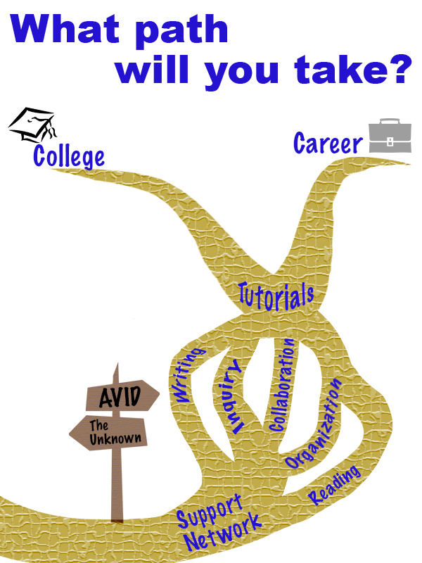
Originally I was intending to use photos from our events to show what AVID is like. I received a lot of photos my coworkers took at past AVID events. None of them really jumped out at me; they didn’t make the program seem exciting. I started from scratch with the idea that AVID is a path you can choose to take.
I used Creative Commons to find clipart images of a crossroads sign and tried to find a branched path. I had no luck finding a path, but did find a nice clipart of a dead branched tree, so used that as a base for a path. I decided to have the path go upwards since it felt like more of a journey forward that way. The path is also shifted to the right side of the page to follow the rule of thirds. I took the main components that makeup AVID and placed them along the path so kids could see what being a part of AVID would entail. All pieces were written in the same font and the same color, the similarity suggesting that they are all connected. The colors used for the main components are AVIDs colors: blue and gold. For the other components, neutral colors were used so they didn’t distract from the message of AVID.
After making this graphic I double-checked the requirements and noticed that it said it must include three images. I got a little stressed that images means photos, so I began to think that the design didn’t meet requirements. I made a second design project with photos just in case. I don’t think it follows as many design rules, and overall I feel like it got to be too busy looking. My husband likes to constantly tell me I’m an overachiever, so you bet that I’m throwing it on here just in case the first one doesn’t make the cut.
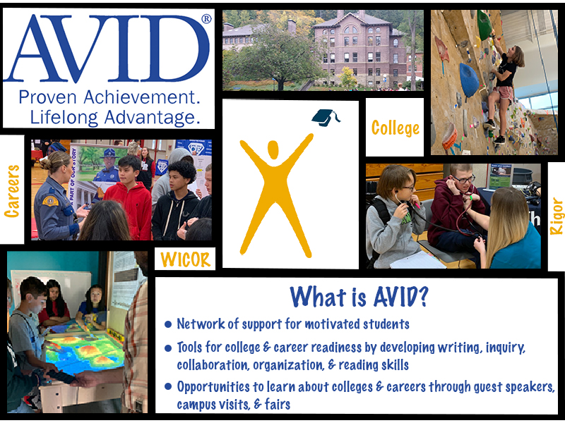
Photo Permissions for 1st design:
Crossroads sign: “jalan persimpangan” is licensed under CC0 1.0
Tree: “branch” is licensed under CC0 1.0
Graduation Cap: “kolej” is licensed under CC0 1.0
Briefcase: “office” is licensed under CC0 1.0
Photos for the 2nd design were all taken by my self or given to me with permissions by my co-workers J. DeLazzari & D. Hendrickson.