Final Logo

So, confession time… this is not my first experience with graphic design.

Now, from one fellow teacher to another, I’m realizing that I probably shouldn’t have said anything because now you’ll have expectations of me, so I think I should clarify a few things:

  1. I have absolutely no formal training.
  2. 99% of my graphic design experience is in Corel Draw, 1% is with Photoshop.

Why would I have graphic design experience but no training? Well, my mom bought the town’s trophy shop when I was 13 and it just so happened to be 3 blocks away from my middle school. I might have been a weird child, because I always went to the shop after school. In all fairness, it got me out of taking the bus and she usually gave me enough money at the end of the day to go buy a milkshake from the burger joint next door.

I don’t think my many years of trophy and plaque designing has given me much of an edge in this class. That 1% of time in Photoshop was typically me using it in an attempt to clean up logos, getting irritated after 20 minutes of trying to make the tools work, and then switching back over to Corel to fix the logo in what my husband lovingly calls the “long and time-consuming way”. The one thing I think it has given me an edge on is that I have a lot of experience with setups and identifying ways they can be improved, like to the point where I can tell if something is just 1/16 of an inch off (it’s a weird, kind of useless, and usually very irritating superpower). It might also help explain why I’m so picky when it comes to making things.

So why did I throw myself under the proverbial bus and mention my background? Because, as a person who has regularly been given raster logos and had to find a way to make them vector, I LOVE the concept of Illustrator and what it can do. As a rational individual who wants things to be pretty straight forward and user-friendly, Illustrator is incredibly frustrating.

Anyways, you’re here for a logo. I’ll remind you that the whole project started with me going to Misty, who gave me the idea to make a logo for our next staff shirts. The criteria were:

  1. Had to include school colors: red and black, gray and white could be used.
  2. Should have a wolf.
  3. Should have our four pillars on it (respectful, responsible, safe, and determined).
  4. Should have the words “staff” and “timberwolves”, if possible.

Our current staff shirts have one of those word collages on it, so I think that got stuck in my head when I started sketching. It lead me to drawing this:

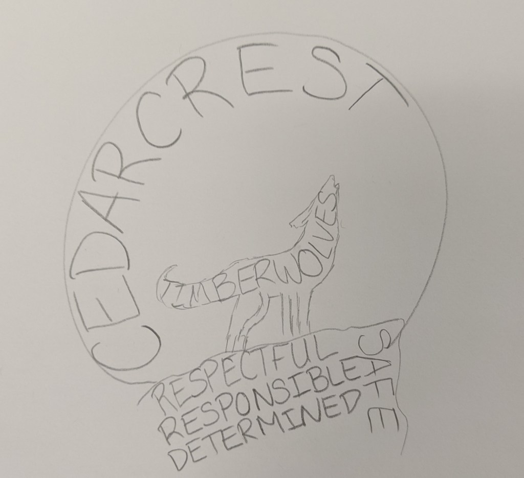
When I drew it, I liked the idea but thought it would be too busy. I sent it off to Misty and got the go-ahead. I created this:

I drew the wolf using the pen tool. It started out as anchor points with flat lines, but then I gave it some curves using the curvature tool and the anchor point tool. Then I decided to focus on the moon. I knew it was possible to create text that formed shapes, but had no idea how to do it, so I went down a Google rabbit-hole. I found a few tutorials that walked me through the steps, and it turned out the process was pretty easy. All you need to do is create the text, create the shape, (make sure the shape is the top layer), and then use the “envelope distort- make with top object”. Creating the moon and rock formation took almost no time. I ran into an issue though when it came to modifying the text of the moon shape to fit the wolf. I assumed I could use the shape builder tool to create the form I wanted, but it wouldn’t work. After playing around with grouping options/shape builder and getting nowhere, I just decided to use the pen tool to outline the shapes to create a new one. I ran into another issue when it came to putting the words in the wolf. For some reason the text kept recognizing anchor points that didn’t actually exist, so it distorted the text so much that you couldn’t read it. I tried with different words (Timberwolves, Staff, Cedarcrest) and decided that staff worked best since it was the shortest word. I tried to look for another way to warp the text and found another video that showed me how to use the “make with mesh” option under the envelope distort feature. Some people probably don’t like that tool because it takes a lot more time, but I actually really liked the ability to modify each letter and get the text to look exactly how I wanted it to. It was time-consuming, but for a control freak like me, very satisfying.

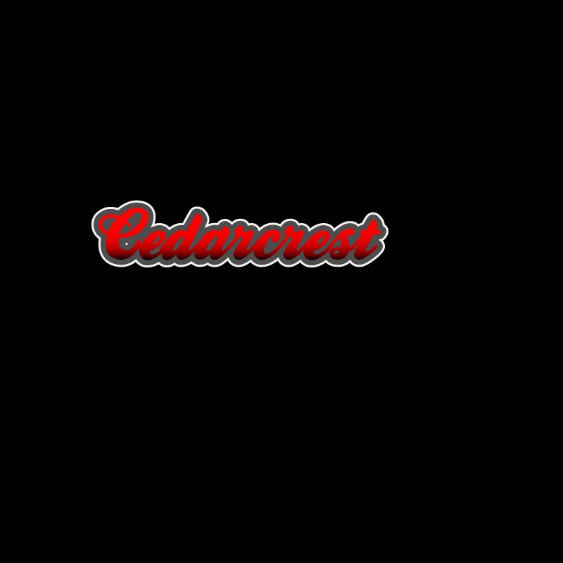
When I was done, I still didn’t love the logo because I thought it was too busy, so I played around with what I learned from the Varisty tutorial to create the Cedarcrest text. To make the text I played with the text kerning, the gradient tool, and adding multiple strokes.

I was really unhappy with how hard it was to read staff in the wolf, so my first solution was to fill the wolf in:

I also took some time to fix the words in the rock and modify the letters in the moon so that it was easier to read. I liked it, but it didn’t meet all of the guidelines that Misty had given me, so I tried another setup:

I thought this would make the words easier to read. I switched the gradient on the Cedarcrest font so that the red was pointed towards the red rocks and the black was on the top; I think I was thinking of the sun setting and the moon rising when I did it.

I was a little bit happier with this, but still thought it was too busy. I spent days telling myself I was just being too picky, and then realized that I shouldn’t be the only person’s opinion that matters. S. She agreed with me that they had good elements, but they were too busy. We started moving things around and ended up with a bunch of different layouts.

Since we agreed that the layouts were too busy, we started cutting stuff out. The pillars were the first things we ditched. While they are important to our school culture, they aren’t as important as our name or the wolf. She really wanted to keep the “staff” in the design, but we agreed that it didn’t need to be huge. We left it in the moon because it still showed the cool text wrapping and gave the effect of the wolf howling at the moon.

Misty pointed out that the staff font stuck out like a sore thumb and didn’t work that great with the Cedarcrest lettering. I changed the “middle school” font to be the same as the moon in an attempt to pull it all together. Once it was changed it became pretty obvious to us that the simplistic layout was the best. This ended up being the logo that we liked the most (and my official final product):

Logo Rough Draft

I will admit, this project threw me off; I chalk this up to lack of inspiration.

It’s not that I didn’t have anything to make a logo for, there are plenty of things that I could have made a logo for. I had a hard time narrowing it down as to exactly what I wanted to make the logo for. AVID already has a logo, so that wasn’t an option. My next thought was to make one for our science department, but my teaching partner and I made one a few years ago. I thought I could redesign what we did, but I couldn’t think of a way to improve the design that we originally did. I considered making a logo for our school’s makerspace, but the only ideas I could come up with were things that had already been done. My last thought was to make a new logo for our Lego League team, then I pulled up the “Beenana” that the kids created a few years ago and felt too sentimental to mess with it.

Since I was stuck, I went to bug my teaching BFF and see if she had any suggestions. Misty told me that we needed to get new staff shirts, but they didn’t have a design. We both agreed that we didn’t want our current school logo on the shirts (sorry Bob!).

Now you may be asking, what is wrong with this logo? First off, it’s a raster image, which makes scaling it a nightmare. Unless we wanted it no bigger than a two-by-two square on the t-shirt, it would have been a problem. Secondly, it doesn’t even incorporate our school color (red). Third, my gut just doesn’t like it. The wolf is too complicated, the circle should have been deleted, the spacing of the words around the circle needs adjustment, etc. That might seem picky of me, but if I’m forced to wear this thing on a shirt once a week, then I want to like it.

So Misty and I were in agreement that the best use of my time would be to make a logo for our school that we can use on our shirts (and other things like social media). Since she’s in charge of ASB and has the final say in what goes on the shirt, I basically treated her as my customer and asked her to give me a list of requirements. This is what she came up with:

  1. It had to include our school colors: red and black, I could use gray and white too if needed.
  2. It should have a wolf, possibly howling at the moon.
  3. It should have our four pillars on it (respectful, responsible, safe, and determined).
  4. It should have the words “staff” and “timberwolves” on it if possible.

Using those requirements as a guide, I came up with this:

Now I’m going to be honest, I don’t love it.

Not only did I miss some of the requirements Misty wanted, I see a lot of design flaws with this, which I won’t go into detail with since I’m going to be getting feedback. Even though I don’t love it, there are elements that I like, and I think with a bit of tweaking would be really nice in a final design. I’m thinking my final will probably take a pretty different route, one that might include some of the things I tried when playing around with fonts.

I think after completing the rough draft the spark of inspiration has finally come, it’s just going to take awhile to get a final product I’m going to be happy with.

Graphic Design Final

Today is the day that we reveal our final design for the Graphic Design project. My final looks pretty similar to the draft with only some minor (but effective!) edits. Most people would think “oh, that probably took you no time at all to fix”. That’s definitely what I was telling myself as I sat down to work on it.

Fun story: the final took me nearly 4 hours to edit.

For some reason Photoshop wouldn’t let me apply filters to anything.

“How is that possible?”

I wish I knew, maybe I could have fixed the issue sooner. When I first ran into the issue I asked my husband for help, since he has had to photoshop my brother-in-law into our family Christmas card not once, but twice. He hovered over my shoulder, telling me the steps I needed to do to apply the filter. When it didn’t work he proceeded to tell me that I use photoshop wrong; I pushed him away while telling him to go supervise the Lego League kids. I thought the issue was just with the file, so I opened one of the tutorials to try apply a filter to it; I knew it should work because I had been able to do it in the tutorial. The picture remained the same. I scoured the internet to figure out how to reset all preferences, still no filter application. Ultimately I had to uninstall and reinstall Photoshop in order to fix it and creating an entirely new file for the final in the process.

Now that you’ve heard my sob story, here is my rough draft:

And here is my final:

My previous post mentioned my inspiration came from AVID and people asking me what it is. It’s hard to get an 11-year-old excited about a class that teaches them responsibility, so I find myself telling them it is a path they can choose to take. I used that analogy as the basis of the design. I started by searching Creative Commons for a forked path. I got a lot of pictures of forks and linear paths, the complete opposite of what I wanted. It lead me down a rabbit hole of roads, trails, lanes, and signage. I stumbled upon a crossroads sign, and it sparked a bit of inspiration.

“jalan persimpangan” is licensed under CC0 1.0 

I liked that the sign one only had two possible paths because I could use one for AVID and the other for “not AVID”. I tried to use the tools to make it look more realistic. I started by adding a Hue/Saturation adjustment layer to turn the color brown. I was hoping that I could find a woodgrain filter, but the closest I could find was the texturize filter. Now that I had a sign, I needed a path to go with it. I started searching Creative Commons for things I knew had forks (since apparently their paths didn’t). I found a clipart of a dead tree.

“branch” is licensed under CC0 1.0 

I used the magnetic magic wand tool to outline the parts of the tree that I wanted to duplicate. I copied the parts to another layer and Frankensteined them together until they had a shape that I liked. At the start, I had the design set up as landscape, but as a built the path everything was too tightly packed together. A lot of paths ran off the page. I started to think that was a bad design choice since the crossroads sign labeled the path that goes off the page as “the unknown”. I figured running more paths off of the page would leave the audience confused, too many unknowns. I changed the orientation to portrait and found it more appealing. Not only did it gave me more space, traveling upwards felt like a more impactful (subliminal) message than traveling sideways. The path is concentrated on the right side of the page, following the rule-of-thirds. The solid color path didn’t look too appealing (in my opinion), so I decided to add texture to it to make it more interesting. I chose the mosaic filter because I thought it gave a look similar to a brick.

Starting design with the layout being landscape.

The words that are spread throughout the path are the main components of AVID. The course’s foundation is building relationships and creating support networks for kids, so I knew that needed to be the first thing on the path. The entire curriculum works on developing kids’ WICOR skills. Usually, in a lesson you’ll focus on one or two of the skills, but they are put to use during tutorials, which are run twice a week. Our ultimate goal is that kids will then utilize those skills to be successful in their careers and/or further their education. I played around a lot with the text settings. Most of the terms are warped to an arc so they look like they curve with the path. I also had to adjust the kerning and height of the letters using the character settings.

I placed pictures at the end of the paths instead of clipart at the suggestion of my peers. At first, I couldn’t decide if I wanted to frame the images or cut them out and blend them into the background. Eventually, I decided to cut and blend because putting them in frames made them feel separate and not connected with the clipart. To do this I used the magnetic magic want tool to outline the parts that I wanted. I then used the eraser tool to create a feathered edge on parts of the photos.

My color decisions came pretty easily. Since AVID is a national organization I figured it would be best to use their colors (gold and blue) as the main components. The writing popped out better when it was gold and the path was blue, but I ultimately decided on using gold for the path because of “golden opportunity”; it also reminded me of the Wizard of Oz and the yellow brick road. On my rough draft, I noticed I used the wrong values of blue and gold, so I used the dropper tool to match them to the AVID logo. When I went to change the color of the path is when I ran into my filter issue. I tried to use the fill tool, but it would only color one “brick” at a time. I decided to redraw the path with the pen tool, which was very confusing since I could see the outline of what I drew but it wasn’t a part of any of the layers. I saved it as a custom shape and then used the shape tool to draw it again. I struggled with getting it filled, but found the shape under the paths tab and linked it to a layer. I was able to color the layer with the correct gold and then applied the filter to just the path. I noticed that when I did it this way, I still have the freedom of changing the path color if I want without having to fill each individual brick. I kept the background white so that it was neutral and didn’t take away or distract from the overall message.

I don’t know if my explanation does a good enough job of explaining the design concepts we’ve been learning. I can, however, sum it up like this:

“Design is not a science, just move things around until it feels right”

Matt Greenwood