I will admit, this project threw me off; I chalk this up to lack of inspiration.
It’s not that I didn’t have anything to make a logo for, there are plenty of things that I could have made a logo for. I had a hard time narrowing it down as to exactly what I wanted to make the logo for. AVID already has a logo, so that wasn’t an option. My next thought was to make one for our science department, but my teaching partner and I made one a few years ago. I thought I could redesign what we did, but I couldn’t think of a way to improve the design that we originally did. I considered making a logo for our school’s makerspace, but the only ideas I could come up with were things that had already been done. My last thought was to make a new logo for our Lego League team, then I pulled up the “Beenana” that the kids created a few years ago and felt too sentimental to mess with it.
Since I was stuck, I went to bug my teaching BFF and see if she had any suggestions. Misty told me that we needed to get new staff shirts, but they didn’t have a design. We both agreed that we didn’t want our current school logo on the shirts (sorry Bob!).
Now you may be asking, what is wrong with this logo? First off, it’s a raster image, which makes scaling it a nightmare. Unless we wanted it no bigger than a two-by-two square on the t-shirt, it would have been a problem. Secondly, it doesn’t even incorporate our school color (red). Third, my gut just doesn’t like it. The wolf is too complicated, the circle should have been deleted, the spacing of the words around the circle needs adjustment, etc. That might seem picky of me, but if I’m forced to wear this thing on a shirt once a week, then I want to like it.
So Misty and I were in agreement that the best use of my time would be to make a logo for our school that we can use on our shirts (and other things like social media). Since she’s in charge of ASB and has the final say in what goes on the shirt, I basically treated her as my customer and asked her to give me a list of requirements. This is what she came up with:
- It had to include our school colors: red and black, I could use gray and white too if needed.
- It should have a wolf, possibly howling at the moon.
- It should have our four pillars on it (respectful, responsible, safe, and determined).
- It should have the words “staff” and “timberwolves” on it if possible.
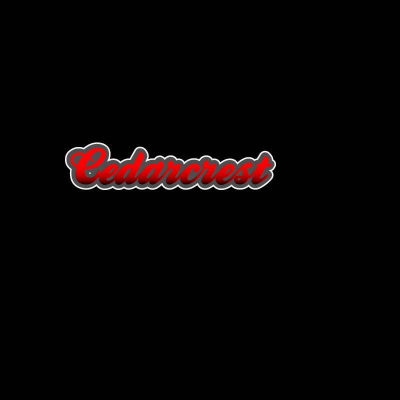
Using those requirements as a guide, I came up with this:
Now I’m going to be honest, I don’t love it.
Not only did I miss some of the requirements Misty wanted, I see a lot of design flaws with this, which I won’t go into detail with since I’m going to be getting feedback. Even though I don’t love it, there are elements that I like, and I think with a bit of tweaking would be really nice in a final design. I’m thinking my final will probably take a pretty different route, one that might include some of the things I tried when playing around with fonts.
I think after completing the rough draft the spark of inspiration has finally come, it’s just going to take awhile to get a final product I’m going to be happy with.

Hi Kacee –
It’s always nice to see teachers who are so passionate about their work. We have teachers in my family and that makes me appreciate what you do and how you do it. So, ‘thank you’ for being such a positive influence on your kids.
Reading through all your requirements for your logo I think you hit upon a winner with using the word ‘staff’ inside your wolf. You’ve got a bit of ‘figure-ground’ design going on there and it’s really a cool look. Adding to that, with your school name in the moon and the wolf howling at the moon it brings that piece of your logo all together.
As for your four ‘pillar’ words I can see you were trying to achieve the appearance of the wolf sitting on a ledge or large rock while howling at the moon. This is where I’m going to offer a couple of design suggestions:
1. The angle of the word ‘safe’ makes it difficult to read so I would change that angle
2. There is so much going on in your design that it makes it difficult to absorb everything. Therefore, my thought is to have your wolf and moon be the focus and use your 4 ‘pillar’ words in a different way. Try reducing the text size. Or, what about small red text as words surrounding the moon?
3. Another thought I have is that due to the amount of logo requirements listed perhaps you have part of your design on the front of the shirt (wolf and moon) with the 4 pillar words on the back of the shirt.
I’m definitely going to check-back on your blog to see what you end up with for your final design Kacee. You’ve got a great idea going on here!
Cheers,
Cyndi
LikeLike
Thanks Cyndi!
I agree that there is too much going on with the design. That is what I thought the biggest issue was with it and I think that’s why I don’t love it. When I made our T-shirt design a few years ago we had to put part of it on the back of the shirt, so that’s definitely a possibility I need to look into. The only issue with that is that it costs more money to print them, but oh well.
Thank you for your feedback!
LikeLike
Hi Kacee –
I enjoyed reading the thought process behind the need for a new logo and the challenges involved with meeting all of the requirements your customer provided. Your writing definitely made it sound like a fun project, and I agree with your assessment of the original logo (even though I kind of like the wolf, I can see where it’s not really useful for your purposes).
Regarding your new log design, I love your idea, especially the wolf you chose is howling at the moon. I also like how you were able to incorporate all of the school colors into it — the red, black and gray (in particular) go great together, and using the white around the wolf has your intended effect of looking like a full moon.
Those are just some ideas — I also like what Cyndi wrote. I look forward to seeing your final project and what you come up with.
Mikal
I’m wondering if instead of using the words to create the shapes if it would work to have the four pillars create a type of pillar for the wolf to stand on, keeping the wolf a solid or gradient color with some other effects to add depth, and then make the moon larger so that it’s large enough for the school name and staff to go on the moon in a half circle at the top of the moon.
LikeLike
Thank you Mikal!
After I submitted my post I was considering turning the wolf solid. I think the “Staff” is kind of hard to read, plus making it solid would take away from some of the busyness of the design.
I do like the concept of putting the wolf on something else, so I am going to play around with that. Same with making the moon larger to include the school name and the word staff.
Thank you for the feedback!
LikeLike
Hi Kacee,
To start off, I must say, that I think you’re being too hard on yourself! Your draft logo is very impressive. Like you said, there are a few elements that could use some tweaking, but overall you’ve created a very technically advanced and unique design. I love how you warped and stretched the text to create your images, such a great idea! Especially the wolf! However, like you mentioned, it does make a few of the words tricky to read. Maybe there’s a way to keep that idea, (because it really is an awesome concept) but make it a bit more legible? For example…what if the word “safe” was used to depict just the body of the wolf, and the tail and head were kept as the solid grey color? Or maybe the moon could have the “Cedarcrest” text as the top ark of the moon with a gradient coming down from the bottom of the letters to fill in and create the rest of the circle. I’d be curious to see what a subtle gradient would look like if added to the design, although, part of me thinks it might make the logo too cluttered… Those are just the first two ideas to come to mind, but I’m sure you’ve been trying out every possible option. I can tell that you’ve put a great deal of thought and effort into your draft logo, and I admire your dedication to produce such a high quality logo design for your school. Great job! I look forward to seeing your final logo design!
LikeLike
Thanks Valerie!
I’ve been going back and forth with having a solid wolf or a word wolf, but didn’t consider blending those two things together. I’ll give it a try and see if I can get an effect that works.
I also like the idea of playing with the gradient, so if I can find time I will try that too.
Thank you for the feedback!
LikeLiked by 1 person
My biggest issue with my design is I think it is too busy, which makes it overwhelming. The word staff is really hard to read in the wolf, the word “safe” looks really awkward hanging out on the edge like that, and my husband pointed out that part of the “A” in Cedarcrest is hard to read. So, here is my plan for the final draft:
1. Adjust the wolf. I was planning on making it a solid color, because I believe this will cut down on the busyness and make it easier to focus on the rest of the design. However, I am going to try chunking parts of it (some solid, some words) to see if I can create an effect that I like.
2. Play around with the words in the rock formation under the wolf. I think I need to switch respectful and responsible. Since responsible is longer, I think it will get rid of that weird gap at the top end of the rock formation. I also think that I need to use the mesh feature to warp safe separately from the rest of the words, so it is easier to see and I can place it in the exact positioning that I want.
3. Fix the A in Cedarcrest so that the school name is easier to read.
4. Go back to my client and see what requirements can get cut. Like I said, the design is too busy, and while the guidelines are great, if I try to meet all of them then the design will become overly complicated.
LikeLike